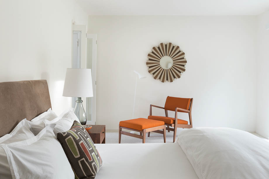
PHOTO STYLING FOR INTERIORS
I often get asked if the homes I shoot really look like the photos. It’s a “yes and no” kind of answer. Here, I want to share with designers and viewers of home design photos some simple styling points that can make interior photos more appealing. Let me break down the ways to style an interior design shoot on three levels: simple, average, and over the top.

The “simplest” level and the quickest way to style a room for photography is to make the room clean and tidy: fluff pillows, straighten drapes, clean surfaces. Next, edit and de-clutter. Our homes become little stash pads for too many things. Remove piles and organize collections. Then, to keep the styling simple, work with what you have in the home: move a vase or a bowl, stack some great books. Go outside and add some foliage to the vase, pick some lemons for the bowl. Living things bring life to the room and the photography.


I define “average” photo styling as having a thoughtful eye for the design, and then bringing in some props and florals. Intellectualize how you want the space and photo to feel. What is missing in the room? How can you soften the room and make it most welcoming in the photograph? What ways can objects help tell the story of the room or home? How can you add layers of meaning and context?


Whatever interior styling level you choose, make a plan. Think about your space, think of the photos and angles you want to capture, think about the feel of the whole group of photos you will be taking, and how each photo might relate to the project and the story. Perhaps make a shot list and decide what you need for each photo. Get inspiration on Pinterest and Houzz, see how others have done it, and decide what works for you.


For designers, this mid-level of styling involves complementing with specific florals, accessories, small art, throws and pillows. For a kitchen shoot, or to photograph a living room, a designer might spend a few hours collecting items and setting them in the room. Think of the room as a base to which you are adding a consciousness layer of coordinating items that will reflect a cohesive story and point of view. Styling can be like adding jewelry to a great outfit.


“Over the top” styling we see each day when flipping through a catalog. In home furnishing catalogs, on each page we see everything brought into a home for a few hours by a team of professional art directors, stylists and movers. Then the furnishings are carefully arranged by a stylist, carefully framed by a photographer, and retouched by a Photoshop pro. No wonder these photos are perfect!

Here is a secret: almost no one lives like you see in the photos. For some major magazine features, giant art is brought in, expensive rugs placed on the floor, major pieces of furniture borrowed, and hundreds of dollars of flowers arranged. Most often it is all real, but only for a day… Even then it might not be real, one chair becomes four with the magic of Photoshop, a chandelier “hangs” from the room only to have all the support stands removed in Photoshop, a great view outside may be another Photoshop trick. Sometimes I think we should call these photos illustrations.
To upgrade a project, think about interjecting big scale art or a dramatic area rug. Work with vendors you have a strong ongoing relationship with, and borrow elements to make a room feel fuller and richer.


